Show Galleries
Show galleries are a collection of planned, live, or on-demand live shopping shows. There are three different approaches to displaying shows on your website:
- Use the Sprii markup elements. This implementation provides the fastest and best way to present your video content on your website. The markup elements and their content are constantly maintained by Sprii.
- Use the Sprii Gallery Templates. Bring your own markup and styling alongside templates which Sprii will use to augment your markup with data and custom events.
- Communicate with our REST API to get a list of shows and their status. Use this method only if you have a specific need that does not fit the markup elements approach.
The Sprii Gallery Element
To add a group of shows to your website, create a div
element with the class sprii-shows-gallery
. You can use data attributes on the element to filter which shows should be shown in the content. Other data attributes can change the look and feel of the shows. Here's an example:
<div
class="sprii-shows-gallery"
data-sprii-statuses="live"></div>
Inside this block, you can add elements that will be shown either if there are shows within the filter (sprii-shows-gallery-has-data
) or when there are no shows within the filter (sprii-shows-gallery-no-data
).
A full example could be:
<div
class="sprii-shows-gallery"
data-sprii-statuses="live">
<div
class="sprii-shows-gallery-has-data"
style="display: none">
<h3>Live</h3>
<p>Watch our current live show</p>
</div>
<div
class="sprii-shows-gallery-no-data"
style="display: none">
We have no active live shows. Sign up to our newslette to be notified when we go live
</div>
</div>
Data properties
The following table is a list of data properties. All properties should have the prefix data-sprii-
so, as example statuses
will be data-sprii-statuses
Id | Possible values | Description |
---|---|---|
statuses | planned,vod,live | The status of the shows (planned, video on demand, live) |
mode | shows or products, (default: shows) | Should we fetch shows or products. |
show-expired | true / false | If true, shows where purchased deadline has expired will still be shows. Link mode can be activated for there events |
event-ids | commaseperated event ids | Show a specific lidt of events |
tags | commaseperated list of show tags | If events in sprii have been given tags, you can use these tags to filter. Seperate by comma (,) |
store-ids | commaseperated list of sprii stores | If you have agreement with other sprii uses to show their shows on your website, you can add a list of those stores. Rememeber, these stores need to whitelist your domain. Seperate by comma (,) |
product-ids | commaseperated product ids | Use when presentation is products |
product-categories | commaseperated product categories | Use when presentation is products |
sort | asc,desc (default: desc) | Sorting direction of shows. Based on the time the show was live or clip was created |
lang | da,en,no,se (default: en) | i18n language |
presentation | list,swiper (default: list) | Present the shows as a gallery list, or as a swiper |
page-size | Number | How many shows to fetch per page. "Load more" will be shown when more shows can be fetched |
Gallery examples
Go get an idea of how to set up the shows, we have have created some ready-to-use examples
Complete live shopping page.
This example is a landing page where you want 3 sections:
- On top a section if a show is currently live
- After that a section of planned shows
- And last all the on-demand shows that are available
<div class="sprii-shows-gallery-wrapper">
<!-- Block with live shows, if any -->
<div
class="sprii-shows-gallery"
data-sprii-statuses="live">
<div
class="sprii-shows-gallery-has-data"
style="display: none">
<h4>Watch our live show!</h4>
</div>
</div>
<!-- Block with planned shows. A CTA if no shows are planned -->
<div
class="sprii-shows-gallery"
data-sprii-statuses="planned"
data-sprii-page-size="8">
<div
class="sprii-shows-gallery-has-data"
style="display: none">
<h4>Upcomming shows</h4>
</div>
<div
class="sprii-shows-gallery-no-data"
style="display: none">
<h4>Want to know when we have new planned shows</h4>
<p>Sign up for our newsletter <a href="#">here</a></p>
</div>
</div>
<!-- Block with on-demand -->
<div
class="sprii-shows-gallery"
data-sprii-statuses="vod"
data-sprii-page-size="8">
<div
class="sprii-shows-gallery-has-data"
style="display: none">
<h4>Past shows</h4>
</div>
</div>
</div>
Clips page
A section showing all product clips from a specific product category. Note, Sprii needs to know your product categories.
<div
class="sprii-shows-gallery"
data-sprii-mode="products"
data-sprii-product-category-ids="683829492">
<div
class="sprii-shows-gallery-has-data"
style="display: none">
<h4>Shoes!</h4>
</div>
</div>
Show specific element
If you have a landingpage dedicated to a specific show, then this is an example you can use:
<div
class="sprii-shows-gallery"
data-sprii-event-ids="683829492"></div>
Gallery areas, and managing content from sprii
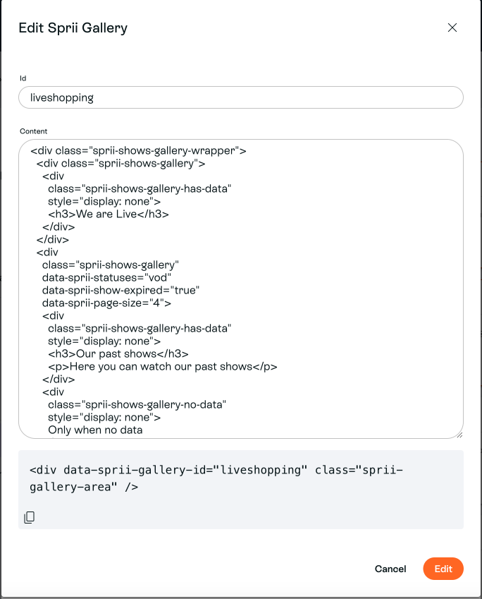
You might not be confident in creating these markup sections on your website. Or maintaining the content can be difficult. Therefor we have created the Sprii Gallery setup.
In sprii you can, with the help from your success agent, create galleries. The content in the galleries is setup in Sprii, and you only need to add this section to your website:
<div
data-sprii-gallery-id="liveshopping"
class="sprii-gallery-area" />
The data-sprii-gallery-id
value is filled directly in sprii. The sdk will look for elements with class sprii-gallery-area
and inject the markup typed in sprii. Screenshot from an exampla setup in Sprii:
The Sprii Gallery Templates
If you want to maintain a consistent look and feel between your website and Sprii content, you can do so by writing your own markups within templates which Sprii will use to render live shows and product clips.
Within your Sprii Gallery Element, you write a template
that would container data-sprii-action
and data-sprii-element
attributes.
Live Show Template
For live shows, you can make use of show-card
templates.
<!-- Basic Live Show templating example -->
<div
class="sprii-shows-gallery"
data-sprii-statuses="vod">
<template data-sprii-template-type="show-card">
<h2 data-sprii-element="name"></h2>
<h3 data-sprii-element="name-short"></h3>
<img
data-sprii-action="open-show"
data-sprii-element="cover-photo" />
<img
data-sprii-action="open-show"
data-sprii-element="cover-photo-portrait" />
<img
data-sprii-action="open-show"
data-sprii-element="video-animation" />
<span data-sprii-element="start-time"></span>
<div data-sprii-element="description"></div>
<a
href="javascript:void(0)"
data-sprii-action="read-more"
>Read more</a
>
</template>
</div>
Clip Template
Similarly for product clips, you can make use of product-card
templates.
<div
class="sprii-shows-gallery"
data-sprii-mode="products">
<template data-sprii-template-type="product-card">
<h2 data-sprii-element="name"></h2>
<img
data-sprii-action="open-clip"
data-sprii-element="photo" />
<div data-sprii-element="price"></div>
</template>
</div>
Template Actions
Template actions are triggered when the user clicks on the element on which data-sprii-action
is present.
The following actions are supported.
data-sprii-template-type value | data-sprii-action value | Description |
---|---|---|
show-card | open-show | This will open the live show dialog and start playing the video |
show-card | read-more | This will open the full description of the live show's dialog |
product-card | open-clip | This will open the product clip video |
Template Elements
Template elements tells Sprii what the content to bind to your markup.
The following elements are supported.
data-sprii-template-type value | data-sprii-element value | Supported HTML tags | Description |
---|---|---|---|
show-card | cover-photo-portrait | img | Portrait cover photo of the live show |
show-card | cover-photo | img | Cover photo of the live show |
show-card | description | Any HTML container. e.g. div | Description of the live show |
show-card | name-short | Any HTML container. e.g. div | Shorter version of the name |
show-card | name | Any HTML container. e.g. div | Name of the live show |
show-card | start-time | Any HTML container. e.g. div | Localized version of the start date & time of the live show |
show-card | video-animation | img | Short animated extract of the live show |
product-card | name | Any HTML container. e.g. div | Name of the product |
product-card | photo | img | Image of the product |
product-card | price | Any HTML container. e.g. div | Price of the product |
Load More Action
By default, Sprii galleries are paged. This means the data is loaded in chunks. Normally, you would need to have a trigger action to request the next chunk.
To do so, you should add a load-more
action to the Sprii gallery.
<!-- Live Show templating example with load more -->
<div
class="sprii-shows-gallery"
data-sprii-statuses="vod">
<!-- load more action -->
<button data-sprii-action="load-more">Load more</button>
<template data-sprii-template-type="show-card">
<h2 data-sprii-element="name"></h2>
<img
data-sprii-action="open-show"
data-sprii-element="cover-photo" />
</template>
</div>
Card Containers
In the above example, the cards will be rendered one after the other in the parent sprii-shows-gallery
container after the load-more
action. However, this behaviour might not be desirable in cases you wish to have additional or more structured content.
In such cases, you could provide container elements with attribute data-sprii-container
with value cards
for rendering the cards and value load-more
if you wish to self contain the load-more
action. The latter ensures that Sprii automatically hides any markup associated with the load-more
action when there is no further chunks to load.
<!-- Structured Live Show templating example with load more and containers -->
<div
class="sprii-shows-gallery"
data-sprii-statuses="vod">
<div data-sprii-container="cards">
<!-- optional, but makes sense to add list of cards alongside other mark-up -->
<!-- Here Sprii will loop the rendered cards -->
</div>
<div data-sprii-container="load-more">
<!-- optional, but makes sense to hide whole load-more markup if no more items, alongside other mark-up -->
<button data-sprii-action="load-more">Load more</button>
</div>
<template data-sprii-template-type="show-card">
<h2 data-sprii-element="name"></h2>
<h3 data-sprii-element="name-short"></h3>
<img
data-sprii-action="open-show"
data-sprii-element="cover-photo" />
<img
data-sprii-action="open-show"
data-sprii-element="cover-photo-portrait" />
<img
data-sprii-action="open-show"
data-sprii-element="video-animation" />
<span data-sprii-element="start-time"></span>
<div data-sprii-element="description"></div>
<a
href="javascript:void(0)"
data-sprii-action="read-more"
>Read more</a
>
</template>
</div>
<!-- Additional content along with Live Show templates with load more and containers -->
<div
class="sprii-shows-gallery"
data-sprii-statuses="vod">
<strong>Having cards container allows you to have more control over the layout.</strong>
<div data-sprii-container="cards">
<!-- Here Sprii will loop the rendered cards -->
</div>
<div>You can add data before or after or around the cards container.</div>
<div data-sprii-container="load-more">
<div>The load more container can have more markup before...</div>
<button data-sprii-action="load-more">Load more</button>
</div>... or after. Sprii hides the whole container when there is no more data</div>
</div>
<template data-sprii-template-type="show-card">
<h2 data-sprii-element="name"></h2>
<h3 data-sprii-element="name-short"></h3>
<img
data-sprii-action="open-show"
data-sprii-element="cover-photo" />
<img
data-sprii-action="open-show"
data-sprii-element="cover-photo-portrait" />
<img
data-sprii-action="open-show"
data-sprii-element="video-animation" />
<span data-sprii-element="start-time"></span>
<div data-sprii-element="description"></div>
<a
href="javascript:void(0)"
data-sprii-action="read-more"
>Read more</a
>
</template>
</div>
Template Helper Classes and Events
Besides rendering the content and handling action triggers, Sprii will also trigger events and add custom classes to help assist any custom implementation your might have.
Sprii will add class sprii-loading
on the corresponding parent sprii-shows-gallery
container while loading the initial or additional chunks of content.
Outgoing Events
Sprii dispatches a set of outgoing events to assist custom implementations.
Event Name | Dispatched on | Description |
---|---|---|
sprii-cards-added | Immediate parent card container and bubbles up | Fires every time a set of cards are rendered. Event data: { newIdsAdded: string[]; hasMore: boolean } |
sprii-cards-cleared | Immediate parent card container and bubbles up | Fires every time all the cards are removed. |
sprii-cards-removed | Immediate parent card container and bubbles up | Fires every time a set of cards are removed. Event data: { removedIds: string[] } |
sprii-data-loading | sprii-shows-gallery container and bubbles up | Fires every time a chunk of data is requested. |
sprii-data-loaded | sprii-shows-gallery container and bubbles up | Fires every time a request for a chunk of data is completed. |
Incoming Events
Sprii also listens to custom events to assist custom implementations
Event Name | Listened on | Description |
---|---|---|
sprii-evt-load-more | sprii-shows-gallery container | This triggers the loading of the next chunk of data. |
sprii-evt-reload | sprii-shows-gallery container | This triggers the reload of the whole gallery. |
Example using Helper Classes and Events
A more elaborate use-case with the events, using a third-party slider library, Splide
It's the result of the following code snippet
<script src="https://cdn.jsdelivr.net/npm/@splidejs/splide@4.1.4/dist/js/splide.min.js"></script>
<link
rel="stylesheet"
href="https://cdn.jsdelivr.net/npm/@splidejs/splide@4.1.4/dist/css/splide.min.css" />
<!-- .... -->
<div
id="myShowsGallery"
class="sprii-shows-gallery"
data-sprii-statuses="vod">
<div class="splide__track">
<ul
class="splide__list"
data-sprii-container="cards"></ul>
</div>
<template data-sprii-template-type="show-card">
<li class="splide__slide">
<div class="splide-content">
<img
class="show-cover"
data-sprii-action="open-show"
data-sprii-element="cover-photo" />
<div class="info">
<div
class="name"
data-sprii-element="name"></div>
<div
class="time"
data-sprii-element="start-time"></div>
</div>
<img
class="show-animation"
data-sprii-action="open-show"
data-sprii-element="video-animation" />
<div class="read-more-container">
<a
href="javascript:void(0)"
data-sprii-action="read-more"
>Read more</a
>
</div>
</div>
</li>
</template>
</div>
<!-- ... -->
<script>
const myShowsGallery = document.getElementById('myShowsGallery');
const onCardsAdded = (evt: any) => {
if (!templateOptions[options.template].useSplide) {
return;
}
const hasMore = Boolean(evt.detail.hasMore);
if (window.mySplide) {
window.mySplide.options = { rewind: !hasMore };
window.mySplide.refresh();
} else {
window.mySplide = new Splide(myShowsGallery.value, {
rewind: !hasMore,
}).mount();
}
const existingMoreSplideIndex = window.mySplide.Components.Slides.get().findIndex(
(slide: any) => slide.slide.classList.contains('show-more-splide')
);
if (existingMoreSplideIndex > -1) {
window.mySplide.remove(existingMoreSplideIndex);
}
if (hasMore) {
window.mySplide.add(
`
<li class="splide__slide show-more-splide">
<div class="splide-content splide-more-content">
<div class="more-slides-wrapper">
<a href="javascript:void(0)" class="more-slides">Load more</a>
</div>
</div>
</li>
`
);
myShowsGallery.querySelector('.more-slides')?.addEventListener('click', () => {
myShowsGallery.dispatchEvent(new CustomEvent('sprii-evt-load-more'));
});
}
};
myShowsGallery.addEventListener('sprii-cards-added', onCardsAdded);
</script>
and some custom css from here